



Brief
Create a landing page for ProTech who is launching a new design collection focusing on innovation and unique thinking. The landing page will showcase the products both in overview and detail, aiming to inspire visitors to leave their email addresses for future contact.
Graphic Style: Professional, hopeful, and modern with a sense of contemporaneity and futurism.
Solution
To create the landing page for ProTech’s new design collection, we began with thorough research to understand the brand’s identity and target audience. Our goal was to ensure the landing page showcased the innovative and unique aspects of the new collection while aligning with ProTech’s professional and forward-thinking image.
We started by gathering inspiration from modern design trends, focusing on clean lines, minimalistic layouts, and high-quality visuals. Wireframes were created to outline the page structure, including a hero image, product overviews, detailed views, and a prominent call-to-action for email sign-ups.
For the visual design, we selected high-resolution images of the new collection, produced by the CG team, highlighting both aesthetic appeal and functional innovation. We used soft, muted, and soothing colors to create a sense of calm and well-being, combined with sharp corners and square shapes to add an edge. Sleek animations and transitions added dynamic elements without overwhelming the user.
Ensuring a seamless email sign-up process was key. Strategically positioned sign-up forms offered incentives like exclusive previews and discounts. Usability testing with target users helped refine the design, leading to improvements in readability, mobile optimization, and overall user experience.
We worked closely with the development team to ensure smooth implementation. The result was a landing page that inspired and engaged visitors, effectively capturing their interest and encouraging email subscriptions. The project successfully combined aesthetic appeal with functional excellence, reflecting ProTech’s commitment to innovation and unique thinking.
This comprehensive approach ensured the landing page was both visually stunning and highly functional, meeting ProTech’s goals and delighting their audience.
Brief
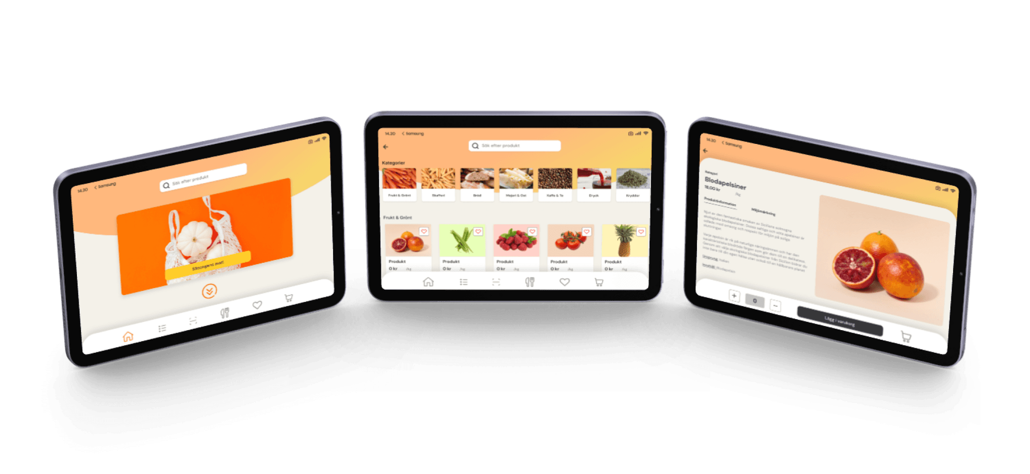
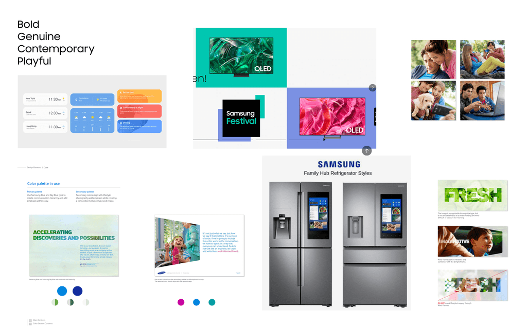
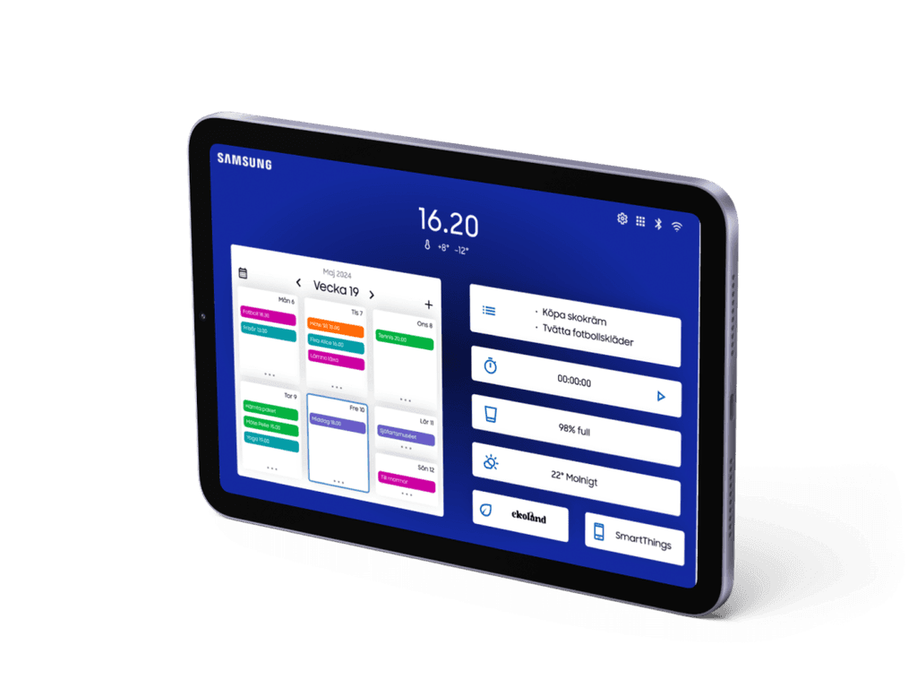
Enhance the design and user experience of Samsung's refrigerator screen, integrate “Ekoland” for sustainable purchases. The goal is to promote sustainable lifestyles and increase awareness of sustainability in line with UN Goal 12.8.
An e-commerce site should guide users toward sustainable choices. The work involves research, planning, prototyping, testing, include an AI-feature and creating a visual identity, as well as a presentation in Figma.
Approach
I commenced by immersing myself in consumer research to understand buying habits and sustainable preferences. Analyzing the data closely, I extrapolated patterns and demands that influenced my choice of designs.
Consequently, a comprehensive plan for the UI and UX design of Samsung's fridge LCD panel was created. The design underwent multiple revisions following prototyping and user testing, enhancing its user interaction and functionality. The introduction of the Ekoland feature was crucial. I opted to integrate AI capable of scanning groceries, enabling detailed revelations of product specifics such as eco-tags, and suggesting eco-friendlier options to shoppers.
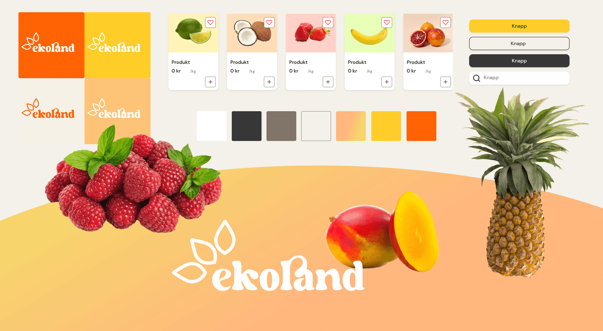
At the same time, I developed a visual brand identity for the application that highlighted its environmental focus. The creation of a clear, compelling visual identity strengthened the application's messaging about sustainability, attracting users to make more considered buying decisions. I avoided the usual green eco-theme, leaning towards a more vibrant, contemporary approach instead.
Finally, I compiled the entire design process into a Figma presentation, showcasing my research findings, initial sketches, prototypes, and the finished model.
Read more…
Brief
Enhance the design and user experience of Samsung's refrigerator screen, integrate “Ekoland” for sustainable purchases. The goal is to promote sustainable lifestyles and increase awareness of sustainability in line with UN Goal 12.8.
An e-commerce site should guide users toward sustainable choices. The work involves research, planning, prototyping, testing, include an AI-feature and creating a visual identity, as well as a presentation in Figma.
Approach
I commenced by immersing myself in consumer research to understand buying habits and sustainable preferences. Analyzing the data closely, I extrapolated patterns and demands that influenced my choice of designs.
Consequently, a comprehensive plan for the UI and UX design of Samsung's fridge LCD panel was created. The design underwent multiple revisions following prototyping and user testing, enhancing its user interaction and functionality. The introduction of the Ekoland feature was crucial. I opted to integrate AI capable of scanning groceries, enabling detailed revelations of product specifics such as eco-tags, and suggesting eco-friendlier options to shoppers.
At the same time, I developed a visual brand identity for the application that highlighted its environmental focus. The creation of a clear, compelling visual identity strengthened the application's messaging about sustainability, attracting users to make more considered buying decisions. I avoided the usual green eco-theme, leaning towards a more vibrant, contemporary approach instead.
Finally, I compiled the entire design process into a Figma presentation, showcasing my research findings, initial sketches, prototypes, and the finished model.
Outcome
I was pleased with the visual expression in Ekoland, although it may lean a bit too much towards the fruity sensation. Part of the challenge in this project was creating components and variables in Figma, which I found very enjoyable and would have liked even more time to explore.
The idea behind the AI tool was that it's often difficult to form an opinion about the products you buy. There are often a lot of eco-labels that you're not sure what they mean, and it's not always clear if the product is good or bad from an environmental perspective. Therefore, I wanted it to be easy to retrieve that information, and I also envisioned that the feature could be further developed, for example by providing information on nutritional content.
Tools & Team
Team: Malin Frisk
Tools:Figma, Adobe illustrator